
How much would you normally pay for a magazine?
According with the results from my questionnaire, readers would vary there cost for a magazine from £1-£3, it seems that readers would not pay more then £3 for a magazine. I have taken this into consideration and have made the price of my magazine in the audience's price range of £2.99.
What catches your eye most to a magazine?
From looking at my results it seems that some readers prefer bright colours, this doesn't apply to my magazine as i have kept to a black and white theme, this stands out in another way. Other results show that readers enjoy interviews. I have advertised interviews on my front cover which would hopefully attract different kinds of audiences.
What do you dislike most about a magazine?
The results show that readers are not great fan's of fan pages. this i have considered and have not included. i personally wouldn't of included one because i don't find them very exciting. Adverts are another thing that readers would prefer not included within a magazine, however i think adverts are a good idea to help advertise other magazine and events so i would have included these.
What attracts you to a magazine?
Results show that competitions and stories are most popular and come above pictures, this i have included because results show what the audience like. I have advertised stories mostly, however no competitions, this i will think about in advertising to attract more readers.
How do you listen to your music?
From looking at my results most readers listen to there music through either the Internet or TV, this would be a good opportunity to advertise TV programmes and websites where the latest rock/metal can be heard.
Out of these titles, which appeal to you most?
The results show a tie between METALFACE and Rebellious, from taking these into consideration i chose to go ahead with Rebellious because i feel it has a certain ling to it and overall it went well with the style of my magazine because i felt it wasn't as harsh.
What is your income?
I chose to ask this question because of the things that would of been advertised within the magazine, most results show that readers earn up to £100 which would indicate that most readers are within a teenage range and therefore i would have to consider what would be advertised.
How often do you buy a magazine?
Results show that most readers buy a magazine once a month, this would then show me that i would have to make my magazine monthly, this would mean much more work to show that it took a month to design and have had carefully thought idea's and the reader would be getting there money's worth.
What genre of music are you into?
From looking at the results, i have chosen a good genre to to base my magazine on, because it shows that readers are more into rock/metal/indie then R&B which is completely different, this should reach out to more readers in the public which would boost more sales.
Are you male or female?
This would be important because it would be interesting to see if my magazine reaches out to both genders and to see if i could make it more equal to keep every type of audience happy, results show that females have answered more questions then males.
What age range are you?
From looking at the results it shows more 11-20 have voted, this shows that this is the target market i would be aiming for. I have to take this into consideration when advertising and inputting new ideas within the magazine.
Monday, 10 May 2010
Looking back at your preliminary task, what do you feel you have learnt in the progression from it to the full product?

Improvement from my preminlary task has been vast, i have learnt so much more and have become more experienced using photo shop, I heave learn a number of editing techniques and other methods of presentation. From looking back at my preliminary tasks, they are very basic and only one use of editing has been used, which was the lasso tool to cut out my main image. I have now discovered and learnt easier ways to cut and paste images and fonts which save alot of time and look more neat and accurate then spending time doing it carefully. I have spent months completing my final three  pieces making them look high class. The colouring i used gives a sense of orginallity as well as class. My preliminary tasks were all different colours and this made them look tacky and average. I have used more images in my final pieces which i have taken more care in taking and using a better camera which much more zoom's and pixels.
 pieces making them look high class. The colouring i used gives a sense of orginallity as well as class. My preliminary tasks were all different colours and this made them look tacky and average. I have used more images in my final pieces which i have taken more care in taking and using a better camera which much more zoom's and pixels.
 What have you learnt about technologies from the process of constructing this product?
To create my final three media products i had to chose the editing very carefully. I  used Adobe Photo shop using a Apple Mac computer. Not using one of these before, i had alot of practicing to do. I practiced creating my preliminary task of all three products. since then i have improved vastly using photo shop and have learned to do most things. For my front cover i didn't need to cut my model out because i had already taken her picture onto a white background, this i though would be easier but then soon discovered that the shadowing behind her was a great effect. I collected all my font using http://www.dafont.com/ which was great for all different types of font. I print screened the word i needed and then using the lasso tool highlighting around the outside then rubbed out the white background which went on top, this i thought looked very professional. I created a grey strip along the bottom and then decreased the gradient to show the image underneath. My contents page was very much repeating the skills i had learnt to use for my front cover, by learning how to move I
 mages and fonts around using there layers made it very easy for me to place everything how i wanted them to be presented. For my double page spread i used to font off of the website and copied and paste it onto my page, i then used the angle tool to tilt the words a bit that would match up with the angle of the picture, this i think looks presentable and neat. I placed a line down the center of the page which showed me where the middle was so i didn't go over. The image i took taken by the camera shown already make a dark background because i used the flash in a dark room, this blends in which i think makes a good effect. i took up to 70 photo's and then shortlisted them and chose the best ones, the advantage in taking that many photo's was that i had a various selection to chose from. To present all my work, i used http://www.blogspot.com/ where everything is presented.
 used Adobe Photo shop using a Apple Mac computer. Not using one of these before, i had alot of practicing to do. I practiced creating my preliminary task of all three products. since then i have improved vastly using photo shop and have learned to do most things. For my front cover i didn't need to cut my model out because i had already taken her picture onto a white background, this i though would be easier but then soon discovered that the shadowing behind her was a great effect. I collected all my font using http://www.dafont.com/ which was great for all different types of font. I print screened the word i needed and then using the lasso tool highlighting around the outside then rubbed out the white background which went on top, this i thought looked very professional. I created a grey strip along the bottom and then decreased the gradient to show the image underneath. My contents page was very much repeating the skills i had learnt to use for my front cover, by learning how to move I
 mages and fonts around using there layers made it very easy for me to place everything how i wanted them to be presented. For my double page spread i used to font off of the website and copied and paste it onto my page, i then used the angle tool to tilt the words a bit that would match up with the angle of the picture, this i think looks presentable and neat. I placed a line down the center of the page which showed me where the middle was so i didn't go over. The image i took taken by the camera shown already make a dark background because i used the flash in a dark room, this blends in which i think makes a good effect. i took up to 70 photo's and then shortlisted them and chose the best ones, the advantage in taking that many photo's was that i had a various selection to chose from. To present all my work, i used http://www.blogspot.com/ where everything is presented.
How did you attract/address your audience?
For my media product, i tried to include many different things to attract and keep my readers interested. I tried to make my magazine as unique and original as it could be. For my front cover i tried to catch the audiences attention, not by using colour but going for a black and white theme which i believed would stand out upon other magazines that are coloured. The main image is quite a dark and scary image, this would also attract readers as they would want to have a closer look and see what is being advertised. I haven't cramped too much onto the front cover which would help the audience read the most important bits and would hopefully look further into the magazine if they read something they like. The lettering has also been spaced out to ensure simplicity and presentation. By adding a little bit of colour to a black and white theme advertises importance and that there is a reason why i have chose to make it stand out more. The style in which i have created my media product would attract my target market because it is a rock theme which is the genre of my magazine, the colours are the main colours used throughout my final pieces. For my contents page i have used a plain black background to keep its originallity as many other magazines would not do this. From saving all the information from the front cover i have used it in the contents to fill the page, this would show the reader that there is alot to read which would attract them further and the audience would immediatly take an interest. By adding a little colour in again shows a pattern that would be used throughout and would therefore not come as a surprise to the audience. My contents page looks very full which would attract the reader as my magazine being exciting. My double page spread has tried to keep originallity but personally i feel it has to stick to certain rules. One thing that i have used to attract the audience is the main image fades into the background to give off a sense of mystery, i also feel that this gives my double page spread a look of expert editing and looks very high class. The information isn't all cramped together which would impress the reader as it looks easy to understand. The main heading i think works well with the black background and the main image, it stands out and is very easy to read. The reader would feel at ease while reading this ariticle because of the presentation and the space that is well needed.
Sunday, 9 May 2010
Who would be the audience for your media product?

The audience that my media product has already been described (see target analysis) although i hope that anyone that is caught by the magazine and would be interested in reading would find it enjoyable. They would listen to rock/metal music that would be advertised within the magazine. My target example is into tattoo's and piercings and dresses with a dark fashion sense. This is the stereotypical Rebellious Reader, although the magazine is open to anyone and everyone in the public that likes to read music magazines and wants to try reading a new music magazine on shelves. Festivals would be advertised in my magazine along with different genre's of concerts e.g Pink/metal/Gothic/rock etc. My readers would attend both festivals and concerts therefore they would need a list of whats on. They would attend with friends and family and therefore all the information shown needs to be available and clear to read. The concerts will have the bands logo so readers are familiarised with all the bands and can recognize them easily.
What kind of Media institution might distribute your media product and why?
http://www.bauer.com/
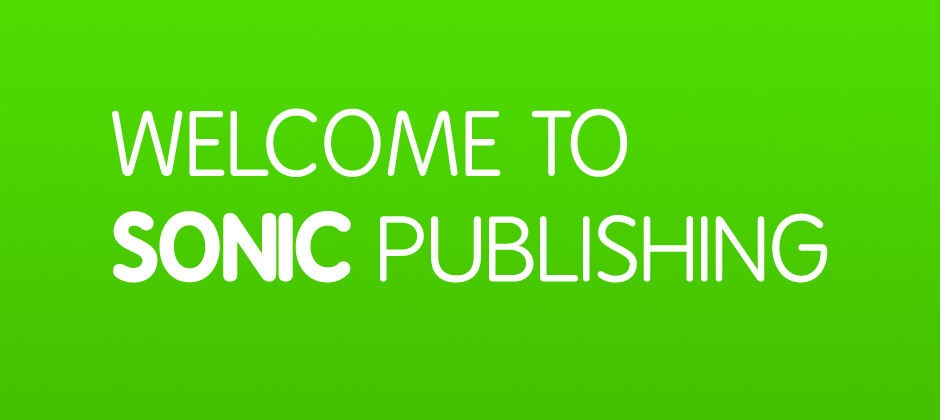
 SONIC PUBLISHING would also be another suitable publishing agency. They are based in London, Rocksound being a famous rock/metal magazine famous for the extra's within e.g posters,stickers ect. I personally find that SONIC PUBLISHING would be a more substantial publisher because of the music featured. If my media product was to be published by SONIC then i think the quality of the company would reflect back onto my magazine idea's.
http://www.sonicpublishing.co.uk/
Thursday, 6 May 2010
How does your media product represent particluar social groups?

Everything about my magazine represents the social group that my magazine aims at. The colours, fonts, images etc. For my front cover i have chosen black and white which immediately shows that it is aimed for an audience interested in rock/metal music. As most rock/metal magazine's do have a dark coloured themed i have kept with the same idea beacause it then should have the same effect and should attract the right kind of people. The image i have used as my main one for my front cover has a scary theme which is also associated with rock/metal fans as some bands also use masks to hide there identuity while playing live concerts. the hair of the model is black which should also indicate who the magazine is aimed at. I think the font used for the front cover has a slight horror theme to it as well, the font is also eroded and matches the theme of the front cover in general but also with the bands that are being adveritsed. The image also has this cartoon look about it, even though the model does seem scary it is also obvious that the model is in-fact female. The image used for my contents page should also indicate what group of people it is aimed at just by the clothes that are being worn. the font has been kept the same as the front cover to keep the effect of horror and eroding. I have kept with the dark coloured theme but added in slight colour at the bottom for a quote i have used a colour which is the colour of blood. T
 his would then fit in with all the conventional Rock/metal listeners. The images at the bottom also have the same dress sense as the readers so they can relate to what they are reading. The colour of the models hair is also the same colour as the quote, as you can see i have tried to keep to the same colouring. My double page spread i personally gives off that horror feel as soon as you are exposed to the main image which is again the masked model which is perfect for a roc
 k/metal magazine. dark colouring is used again and would be throughout the whole magazine. the image blends in with the background which gives off a sense of mystery. the images at the bottom have been placed together to create a wierd picture. I think that the whole page gives off the sense of Rock/metal that the magzine needs.
In what ways does your media product use, develop or challenge forms and conventions of real media products?
 I tried to stick to the conventional forms of real media products because i think it is a safe way to go, as there products sell there are certain things that the real product has that attracts the audience so i included every important, image, style, pug etc. I have included these on all three of my final pieces. on my front cover i have included a hea
 ding, the same as every magazine. it is bold and eye catching so it is easy to spot. also other conventional magazine usually make there main story bigger and bolder then other information so that the audience know what story the magazine is advertising as well as a recommendation to read. the image i have used has been placed onto a white background like most other magazine front covers to excentuate the
  main image which also links up to the main story, i haven't tried anything different because as most magazines have the same style, i wouldn't want to make a difference because it would be a risk with the audience. i have stuck to the style that i know the public like. The pug i have used isn't just a simple shape, i have used a post it note which is a pale yellow, this then adds colour to the front cover but still maintaining its black and white theme. the pug then shows up and the readers attention goes automatically to read what it s
 ays. i haven't seen any other magazine with this idea which helps with its originality also the black and white theme i haven't come across another magazine so therefore i feel that it challenges the form of a conventional magazine. I have included a bar code, cost and date. Every magazine i analysed had these three things and is only right if i include them on mine to give the most basic information to the reader. Like other magazine's other information is shown down the sides and bottom i have kept with the same font for extra info because it is then easy to see what are the most important bits
 i have tried to make clear. When it comes to challenging the forms of a conventional magazine, i have saved all my ideas for the contents and double page spread because the front cover has to be the best quality to attract the audience in the first place. I have kept with the colour theme but adding in a little bit of colour at every opportunity without making the pieces look tacky. Like other magazines i have looked at i have kept with the main heading
  to be bold and eye-catching. I have included not as many images as a normal contents would have because i believe that the information is more important, however i have added a few images that link with the story as well as sticking with the conventional magazine and adding one main image. I am a fan of this image because of the way it blends into the background, which makes it look professional. Unlike other magazines i haven't seen a magazine that is advertising next weeks issue on the contents page, i have added this in because i think its important to advertise the magazine at every chance. I have also included the issue number on the contents instead of the Front cover because its not so important that it has to be displayed on the first page trying
  to attract the audience. Other conventional magazines have there information listed under headings, i personally think that it's a good idea because of how easy it is to find a certain story, therefore i have kept with the same style. Also other magazines normally have quotes presented onto there contents, i have included one as well but i have kept it easy to notice that it is a quote because of where i have placed it. I feel that in some magazines its hard to pick out information because of how cramped and where things are placed. i have tried to keep my contents filled but easy to read as well. Conventional D
 ouble page spreads usually have one page devoted to an image, i have followed this trend but placed part of the heading also on the same page, i think this then clears room on the other page for more important details. My magazine follows all conventional themes as real media products because i think its risky changing the layout of the double pages because the audience wouldn't be used to it and may not like it. i have kept the writing in columns but slight wider then the conventional magazine. I have also placed images underneath to attract the readers attention as they may become bored reading too much information. Underneath the main image i have wrote 'World Exclusive News' this would hopefully catch the readers attention. I have seen this in other magazine's and have placed it round about where other magazines have. As the reader would be flicking through it would stand out and the audience would then be indicated to the main story. Like other magazines it is a must to include a page number and i haven't changed anything about the placement so readers would not get confused. other information show e.g tour dates have been made bold to stand out amongst the story. Conventional magazine's include quotes within their main story, so i have made no exception and done the same exactly within the same style so the audience can tell its a quote. I think that analysing conventional magazine's has helped me alot in completing my three final pieces to make them look as professional and high quality and they could be.


Monday, 26 April 2010

Sunday, 25 April 2010

This photograph was chosen to be the main image on my double page spread. The idea of it was to have black pages and then the image would blend in only to reveal the mask and flame. i thought this would be a good idea considering the theme is dark and scary. i think the story i had in mind would go perfectly with this image as this is my favourite photograph because i think it looks professional. I am trying to keep my magazine classy and not tacky to insure it looks like it was made by a real magazine designer, this is one of the reasons i kept the colouring very simple to ensure the colours did not clash and create a very primary look. also the type of music advertised is rock/metal. This music often uses these particular colours. this image i thought was perfect in this situation to use as a double page spread.

.JPG)
I have chosen these two images of the models eyes to display on one of the pages in my music magazine, i think the detail that is shown makes the photographs look scary, which is the them for my magazine. the shadowing around the the eyes create a dark look. i am going to place the images together because i think they look best close and creates a moment where the eyes open and close, they don't look very interesting set apart. I have used the same model just to show that the images in my magazine are not always going to have there faces covered, however i am aiming to keep a sense of mystery for the models as there whole face is never presented just there features. e.g. mouths eyes etc, or they will be wearing masks, glasses, other facial cover ups to match that story that's being viewed.
Evaluation Of Photographs
i have chosen this photograph to use for my front cover, i think the way the.JPG)
.JPG)
model is positioned leave plenty of room for the magazine heading and other information to be presented down each side. by photographing the model already on a white background saves me editing and cutting the model out to place onto another background. i also think the shadowing around the outside leaves a good effect which i would lose if i edited the model out. by using black and white gives the image a sharpened look which i think compares well to the style of my magazine. my aim is to keep to the same similar colouring throughout all of my final pieces. adding a little colour to stand out. i realise it is rare to find a magazine that specifically specialises in grey scale colouring but i am hoping that by seeing through my idea's will give my magazine a chance of being fresh to the shelves, by presenting itself as simple,new and different.
Wednesday, 17 March 2010
.JPG)

.JPG)
.JPG)
.JPG)
.JPG)
.JPG)
.JPG)
.JPG)

Subscribe to:
Posts (Atom)
